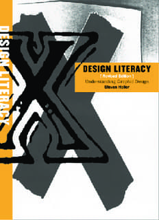
‘Understanding Graphic Design Literacy’ PDF Quick download link is given at the bottom of this article. You can see the PDF demo, size of the PDF, page numbers, and direct download Free PDF of ‘Design Literacy Understanding Graphic Design using the download button.
Design Literacy Understanding Graphic Design Buy PDF Free Download

Understanding Graphic Design Literacy
Victor Moscoso paychedelic Blues Project poster is as illegible today as it was in 1967 when it, and scores of other vibrating rock posters advertising the San Francisco rock scene, first appeared.
It is also as electrifying. Moscoso posters did for graphic design what bands like the Grateful Dead. Jefferson Airplane, and Big Brother and the Holding Company did for rock music turned up the juice and broke all the rules,
During the mid 1960s San Francisco was the vortex of the counterculture. The hippies prevailed, hallucinogenic drugs were plentiful, and rock and roll knew no bounds.
Brooklyn raised, Spanish-born Victor Moscoso (b. 1939) stumbled into this milieu and became a defining force in the distinctly American design genre known as the psychedelic poster.
Characterized by illegible typefaces, vibrating colors, and antique illustrations, psychedelia was a rebellious visual language created to communicate with an exclusive community.
Within a year, however, it was usurped by entrepreneurs who turned it into a trendy commercial style that appealed to a new market of youthful consumers.
Most of the more than sixty posters Moscoso designed during a frenetic eight months in 1967 rejected publicity photos in favor of found images.
For the Blues Project poster, he used a vintage photograph of a nude Salomé. Following her contour, he hand-lettered the concert information in a typeface that Moscoso called Psychedelic Playbill (an adaptation of a Victorian wood type),
Because he drew the letters out of negative space (whiting out all the areas between the bodies of the letterforms rather than drawing them directly), they look as if they have been carved onto the page.
The figure was printed in bright orange against an acid green background: the lettering was printed in process blue.
My goal for the book was to invest cultural value into graphic design while diminishing the stigma of ephemerality.
In the first edition introduction I wrote: “There is now a realization that graphic design is not as ephemeral as the paper it is printed on. Certain advertisements, posters, packages, logos, books, and magazines endure as signposts of artistic, commercial, and technological achievement and speak more about particular epochs or milieus than fine art.
Many objects of graphic design are preserved and studied as more than mere historical wallpaper.
Curiously, though, the makers of these objects—graphic designers—have tended to undervalue the historical significance of artifacts found in their own backyards.
Those who claim visual literacy are often ignorant when it comes to understanding and appreciating the objects that are imprinted with the language of their own practice.”
Some of these essays were based on interviews with the respective makers, some involved primary and secondary research, and still others involved firsthand experience.
Ellen Lupton noted in a review of the book, that I was talking more about my own “literacy” and how it evolved than a book about literacy.
An astute assertion to be sure since I have long used design history as a tool for selfeducation.
Without having had a formal university education, the research and reporting that has gone into many of my essays is akin to devising my own home-study courses.
If this is a flaw, then perhaps it is owing to the fact that many of the essays in Design Literacy are written with the same nerdy fascination I’ve always possessed when presented with astonishing facts that I want to share with others.
Milton Glaser, whom I greatly admire, told me mano a mano that Design Literacy was “all meat and no potatoes.”
This blue-plate metaphor implied that my short essays on loosely linked subjects lacked cohesion, which left the reader
hanging without more overt connections between objects.
In fact, Milton put his finger on what might be called my own learning curve.
Although I have become fluent in many of the subjects I write about in the book, I am also constantly learning about the whys and wherefores—how graphic designs responded to all kinds of external cultural, political and economic stimuli.
So to continue Milton’s food analogy, this book is a tasting menu, with a smorgasbord of dishes that ultimately nourish . . . but may leave some people hungry for more.
Related PDFs
Draw 50 Animals PDF With Simple Step
Drawing Comics The Marvel Way PDF
Design Literacy Understanding Graphic Design Free Download