‘NCERT Solutions for Class 8 Maths Chapter 15′ PDF Quick download link is given at the bottom of this article. You can see the PDF demo, size of the PDF, page numbers, and direct download Free PDF of ‘Ncert Class 8 Maths Chapter 15 Exercise Solution’ using the download button.
NCERT Class 8 Maths Textbook Chapter 15 With Answer Book PDF Free Download
Chapter 15:Introduction To Graphs
15.1 Introduction
Have you seen graphs in the newspapers, television, magazines, books, etc.?
The purpose of the graph is to show numerical facts in visual form so that they can be understood quickly, easily, and clearly. Thus graphs are visual representations of data collected.
Data can also be presented in the form of a table; however, a graphical presentation is easier to understand.
This is true in particular when there is a trend or comparison to be shown. We have already seen some types of graphs. Let us quickly recall them here.
15.1.1 A Bar graph
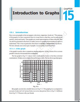
A bar graph is used to show a comparison among categories. It may consist of two or more parallel vertical (or horizontal) bars (rectangles).
The bar graph in Fig 15.1 shows Anu’s mathematics marks in the three-terminal examinations. It helps you to compare her performance easily. She has shown good progress
Author | NCERT |
Language | English |
No. of Pages | 18 |
PDF Size | 993 KB |
Category | Mathematics |
Source/ Credits | ncert.nic.in |
NCERT Solutions Class 8 Maths Chapter 15 Introduction To Graphs
1. The following graph shows the temperature of a patient in a hospital, recorded every hour.
(a) What was the patient’s temperature at 1 p.m.?
(b) When was the patient’s temperature 38.5° C?

(c) The patient’s temperature was the same two times during the period given.
What were these two times?
(d) What was the temperature at 1.30 p.m.? How did you arrive at your answer?
(e) During which periods did the patients’ temperature show an upward trend?
Solution:
(a) The patient’s temperature was 36.5oC at 1 p.m.
(b) The patient’s temperature was 38.5oC at 12noon.
(c) The patient’s temperature was the same at 1 p.m. and 2p.m
(d) The temperature at 1.30p.m. is 36.5oC.
The point between 1p.m.and 2 p.m., the x-axis is equidistant from the two points showing 1 p.m. and 2 p.m. So it represents 1.30 p.m. Similarly, the point on the y-axis, between 360 C and 370 C will represent 36.50 C.
(e) The patient’s temperature showed an upward trend from 9a.m.to 11 a.m. and from 2 p.m. to 3 p.m.
2. The following line graph shows the yearly sales figures for a manufacturing company.

(a) What were the sales in (i) 2002 (ii) 2006?
(b) What were the sales in (i) 2003 (ii) 2005?
(c) Compute the difference between the sales in 2002and 2006.
(d) In which year was there the greatest difference between the sales as compared to its
previous year?
Solution:
(a) The sales in:
(i) 2002 was Rs.4 crores and (ii) 2006 was Rs.8 crores
(b) The sales in:
(i) 2003 was Rs.7 crores and (ii) 2005 was Rs.10 crores.
(c) The difference of sales in 2002 and 2006 = Rs.8 crores–Rs.4 crores= Rs.4 crores
(d) In the year 2005, there was the greatest difference between the sales and compared to its previous year, which is (Rs. 10 crores –Rs. 6 crores) = Rs. 4 crores.
NCERT Class 8 Maths Textbook Chapter 15 With Answer Book PDF Free Download